The football is good but what about the outfit? Here’s what we think about how teams are getting kitted out for the new season
Arsenal
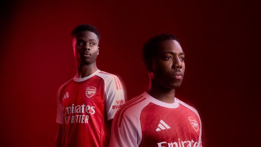
Arsenal’s classic red and white home jersey comes with the red shoulder stripes restored from the blue of last season. It remains sleek, bold and elegant, but with the addition of a Gothic A pattern subtly imprinted all over the front.
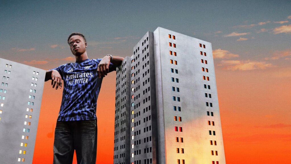
The away kit is an electric black and blue pattern with lightning bolts to match, which the club say “draws inspiration from the famous Royal Arsenal Gatehouse lightning bolt”. There are red Adidas stripes on the shoulders to make it pop and the lettering completes the classy design in its metallic silver.
The launch is even more eye-catching, showing Arsenal’s stars 100 feet tall and dominating the skyscrapers and skylines of notable cities like New York, Paris and Singapore. The caption: ready for new heights. Or that’s the hope anyway.
Barcelona
This year more stripes have been brought back to the traditional blaugrana ensemble. But underwhelmingly it now features a gradient, a downgrade from the clear, bold ensemble of last year. The shirt is saved by the striking yellow of the logos which produces impressive contrast.
Chelsea
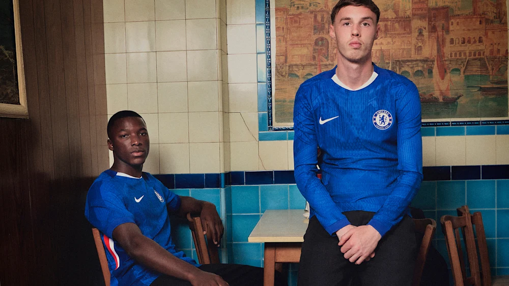
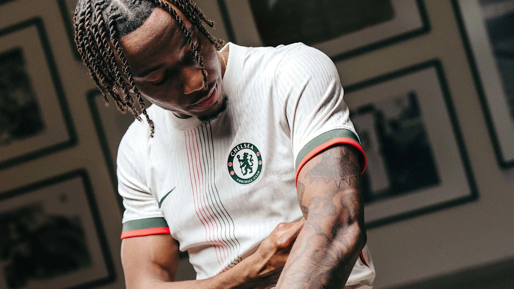
Chelsea have ditched the weird tie dye pattern that featured prominently on the home kit last season, but a full return to the traditional, plain royal blue they have historically preferred wasn’t on the cards. So the new shirt features “a textured clash print” the club say weaves London’s iconic landmarks into the ensemble.
Fans hoping to compete for the best design trophy may have to look to the away kit, which features red and green pinstripes centred on a textured white base. The Nike and club logos appear symmetrically on either side. The washed green detailing on the chest and sleeves adds a further touch of elegance.
Manchester United
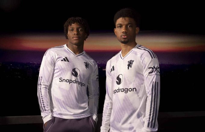
Manchester United’s traditional red home jersey embraces darker elements, including dark Adidas stripes on the shoulder and dark lines on the sides. On the sleeves there is a graphic in different shades of red which United say “showcases the various elements of the pitch, stands and tunnel” of Old Trafford, but far more catchy is the Gothic lettering on the back with its spiky ends that embrace the club’s “Devilish” identity.
The away kit features a white base with a “snowflake graphic”. The black detailing also makes an appearance here, perfectly contrasting with the white and emphasising the Adidas logo, shirt sponsor and the iconic Devil’s crest.

Newcastle
Newcastle’s fortunes changed in 2021 when Saudi Arabia’s Public Investment Fund became majority owners. They’ve made it to the Champions League twice now in three years and while they might not play the best football among Europe’s elite on the pitch, they are certainly determined to be the best dressed.
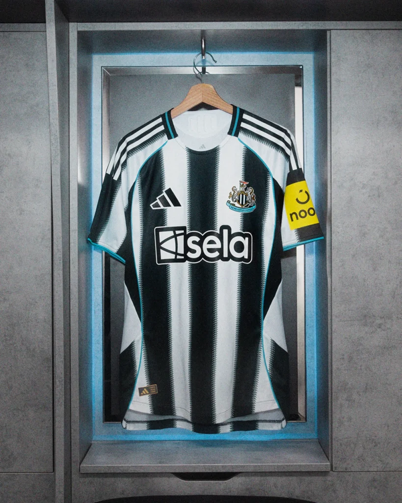
How do the club manage to keep making black and white stripes as fascinating as possible every year? This season, the traditional stripes appear with a shepherd’s check that creates zig-zag edges and keeps the shirt buzzing with activity. There are light blue highlights on the neck, badge, sides and sleeves, and the shirt sleeve sponsor continues to add just a little yellow to cancel out the minimalist ensemble.
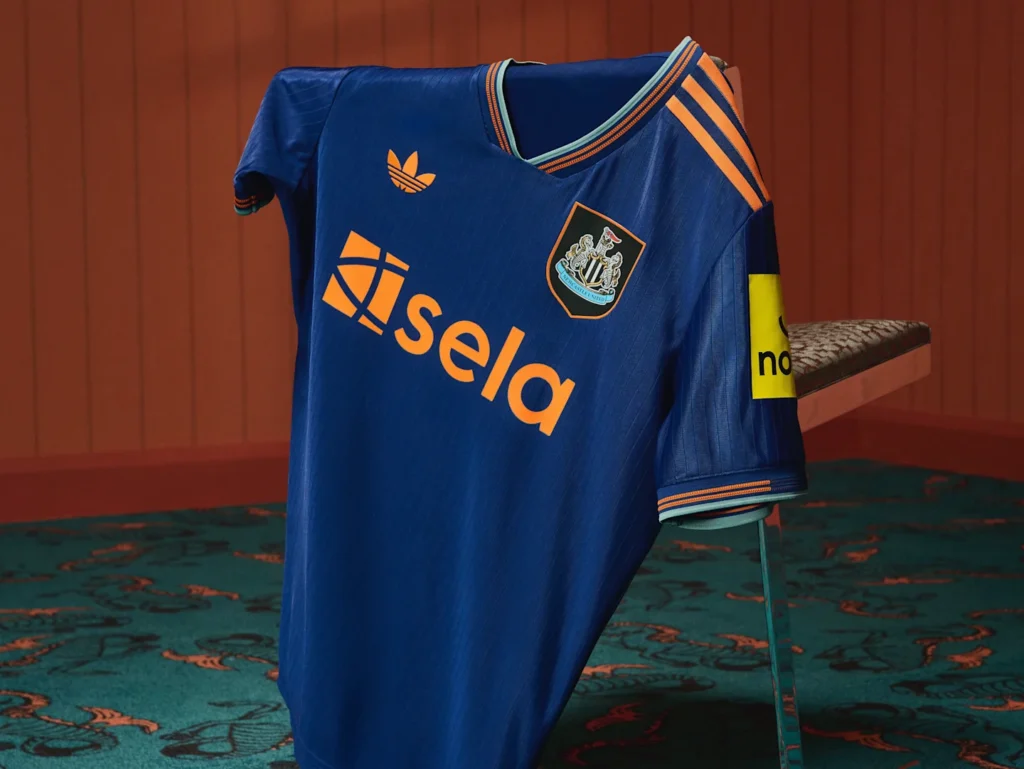
The third kit pays tribute to the 97/98 third kit won by Alan Shearer. The club call it “a striking combination of burnt orange and deep green set against a navy backdrop”. The orange highlights contrasting with the navy are indeed monumentally fascinating. It just works.
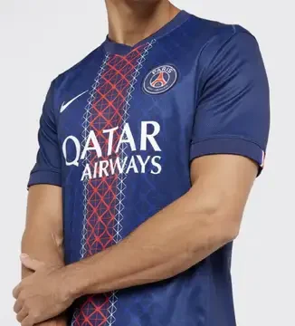
Paris Saint-Germain
Furiously proud of their history-making Champions League victory in May, PSG can further flaunt their identity with a … change in the traditional vertical red bar. It is now a darker shade of red and features a geometric design paying tribute to the Eiffel Tower. But other than that, it’s hard to look at the kit and see anything other than the club’s muted traditional colours. The launch video is infinitely more interesting than the kit itself.
Real Madrid
The home kit has of course the traditional white base, subtly punctuated with blobs of light grey and contrasted with black logos and Adidas stripes. A golden highlight is added to lift the minimalist design but it does not quite add much to the ensemble. The light grey detailing under the arms and along the sides also does very little.
The away kit is much more captivating with its dark navy blue base and almost neon green highlights that frame the front. Real Madrid have a way of picking plain colours for their away and third kits but bringing them alive in a way that adds something the white kit just does not. The kit “evokes the sky at night matches”, if you believe the club’s guff. A classy professional design is rounded off with silver details that reminds them of the Bernabeu, even though the shirt will not be worn there.